Frutiger Font Card Set
PROJECT Design a promotional card set that highlights the features and benefits of any of font of your choosing.
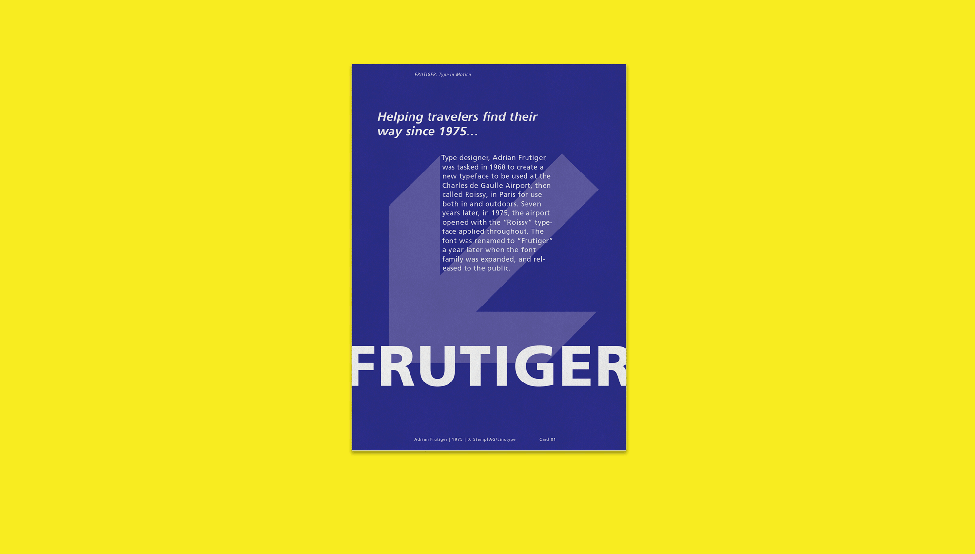
CONCEPT The font I chose for this project was Adrian Frutiger’s eponymous font, Frutiger. Developed for use on signage at the newly built Charles de Gaulle Airport in Paris in 1970, Frutiger was specifically designed to be legible at great distances and at variable text sizes from very small to large. In addition the font was later adopted by the Swiss federal roads department—with some modifications—for use on road signs throughout the country.
The end result of this project came about after struggling with two other design concepts that I just couldn’t make work, mainly because I was focusing on getting the type to work with my illustrations rather than the other way around. What I ended up doing was scrapping those ideas at the last minute, and focusing on just having the type be the decoration.
The final version of the card set is a nod to both the font’s original intended use as airport signage, and its later use on Swiss road signage. The use of pop colors gives it an element of playfulness and youthfulness that is further expressed in the design and copy of the card set.